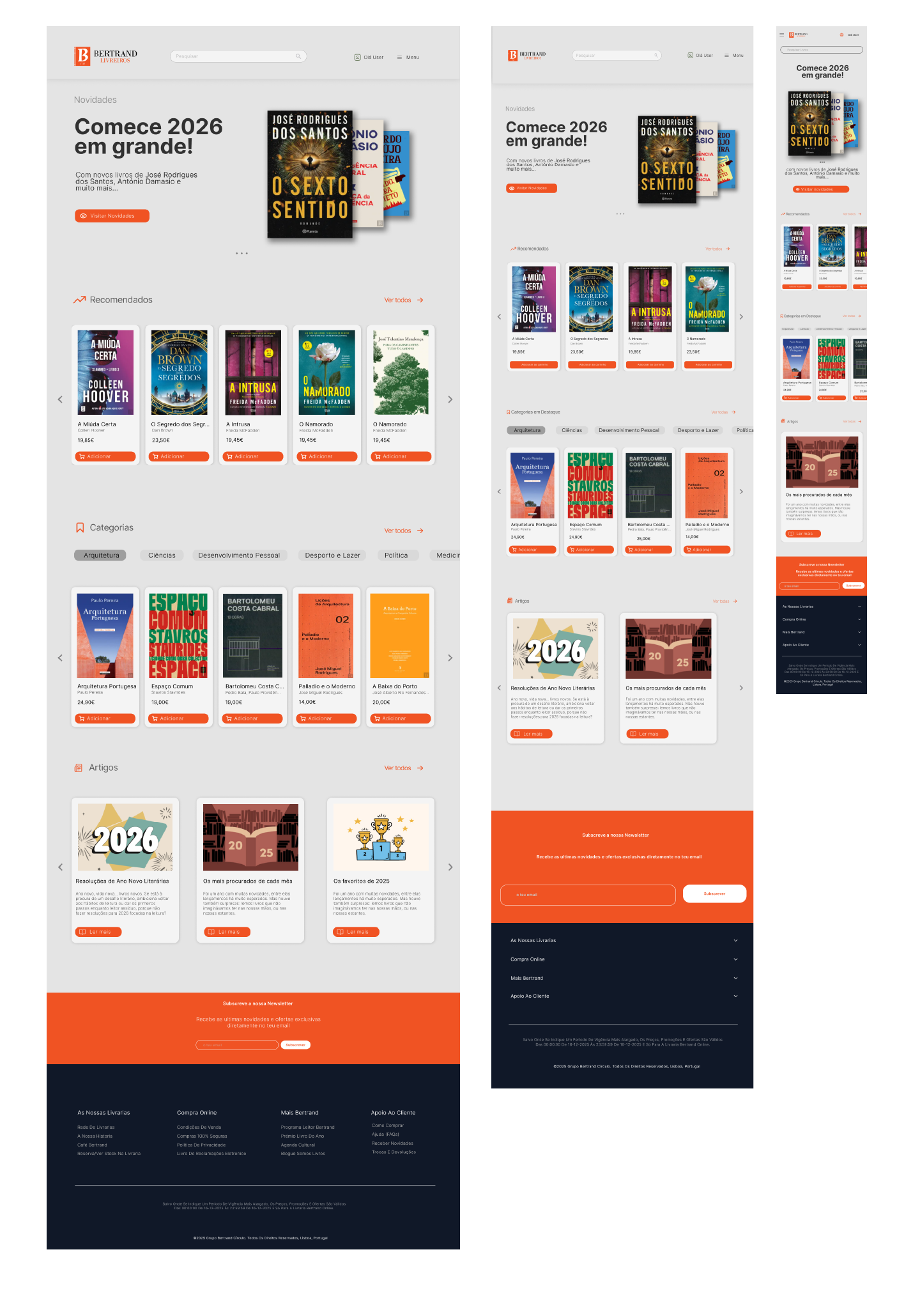
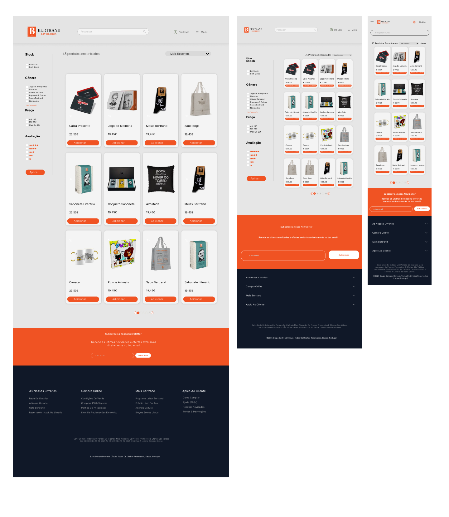
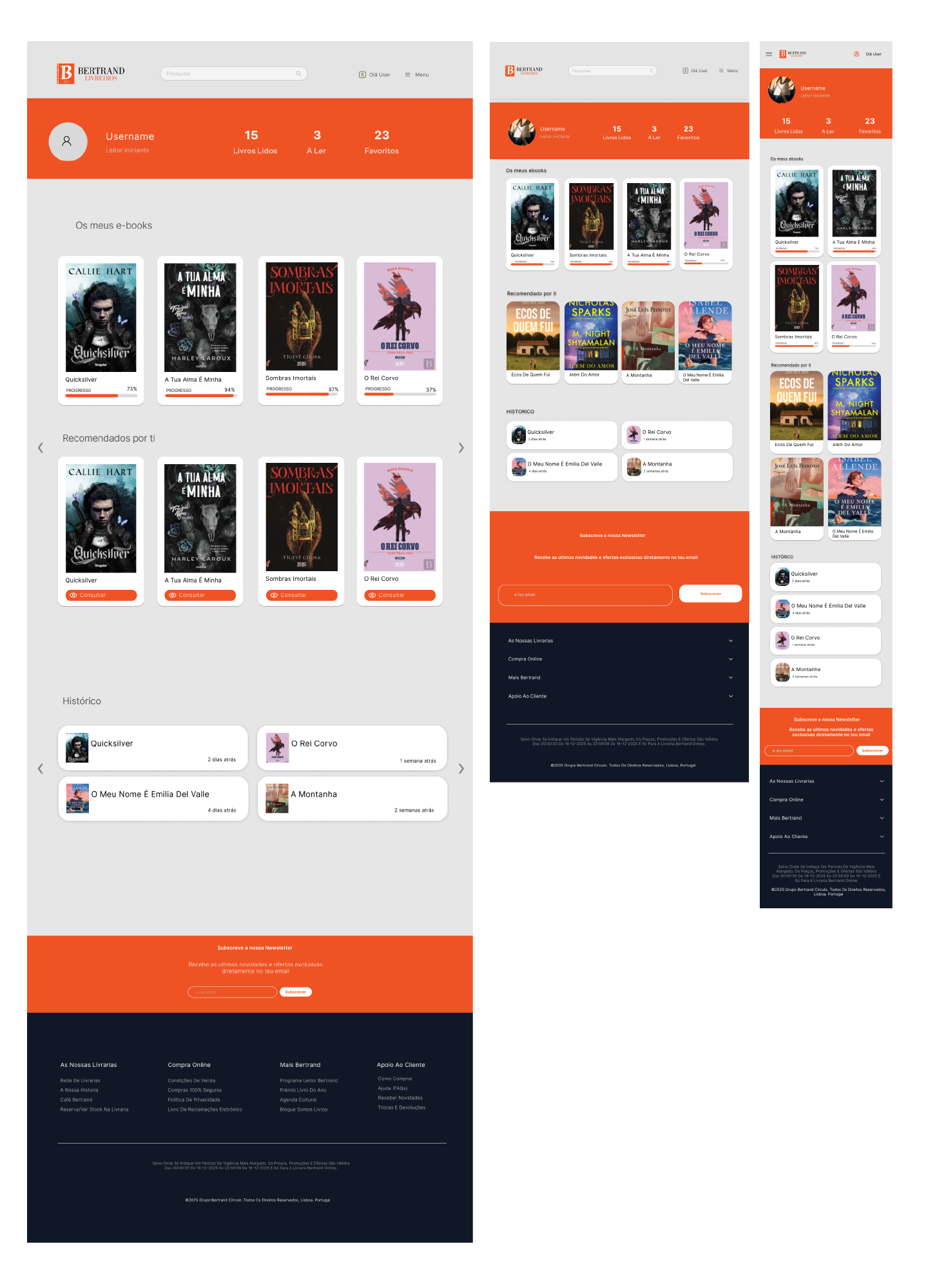
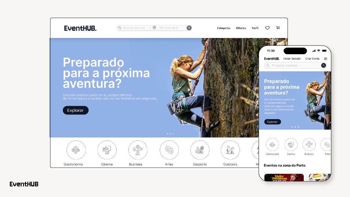
Project Overview 
A UI/UX redesign of Bertrand, one of Portugal’s oldest and most iconic bookstores. The main challenge was to modernize a legacy interface that suffered from excessive "visual noise" and a complex navigation structure. The goal was to simplify the user journey, making the path from discovery to purchase as short and intuitive as possible.

The Strategy (UX Focus
The core objective was to reduce the number of clicks and minimize the user’s cognitive load:
      Navigation Consolidation: I merged scattered sections (such as Stationery and "Livrolicos") into a single, unified "Shop" (Loja) hub. Users can now use internal filters to find specific products instead of navigating through multiple separate pages.
      Logical Grouping: All book genres were centralized under one "Literature" menu, removing redundant buttons that cluttered the original header.
      Friction Reduction: By decluttering the interface, I created a more breathable visual space, ensuring users stay focused on finding their next favorite book without distractions.


Creative Approach (UI Focus)
      Dynamic Hero Section: To modernize the brand's digital presence, I designed a rotating hero banner that displays featured books alongside essential information, providing immediate engagement.
      Interactive Category Discovery: I implemented a horizontal scroll system for categories (Architecture, Science, Personal Development, etc.). This allows users to toggle between genres and preview books directly on the homepage without reloading pages, making the experience feel fluid and current.
      Visual Refresh: While respecting the brand’s heritage, I introduced a cleaner, minimalist layout with improved typography and spacing to align with modern web standards.

You may also like

Back to Top